You will get pre-defined shotcode under Power Elements tab. Step by step we will describe what you will get or what will do with them. So let’s go

Heading
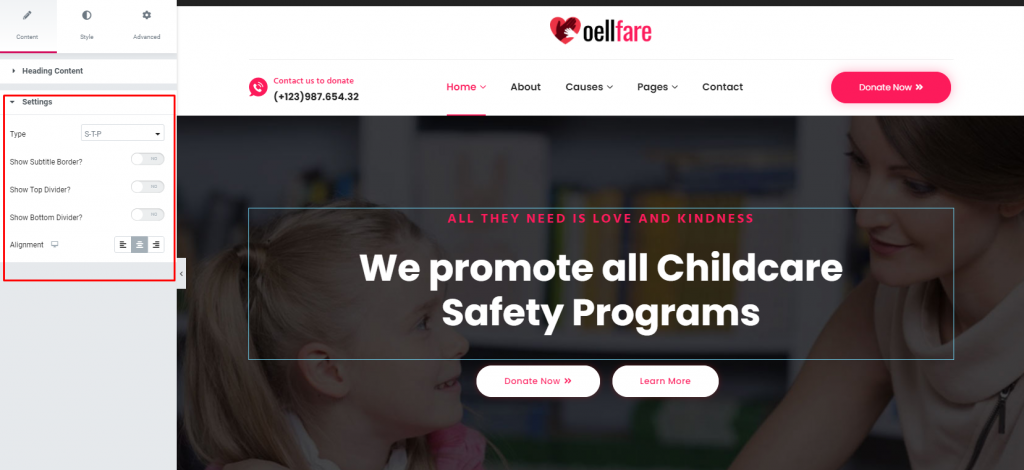
Here you can add here Title, Sub-Title, and Description also you may choose style here through using Type. Find it in red marked box in below.

In Settings there are many types of design as like Type, Top Divider, Bottom Divider, Alignment etc.
Video
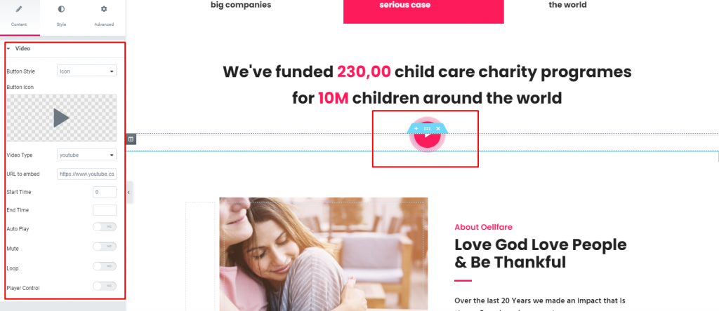
You can use this shortcode to add a video thumbnail image of your choosing alongside a button which you can link to a video. Video Link – Input a link for the video

Image – Upload an image you’d like to display as the video thumbnail.
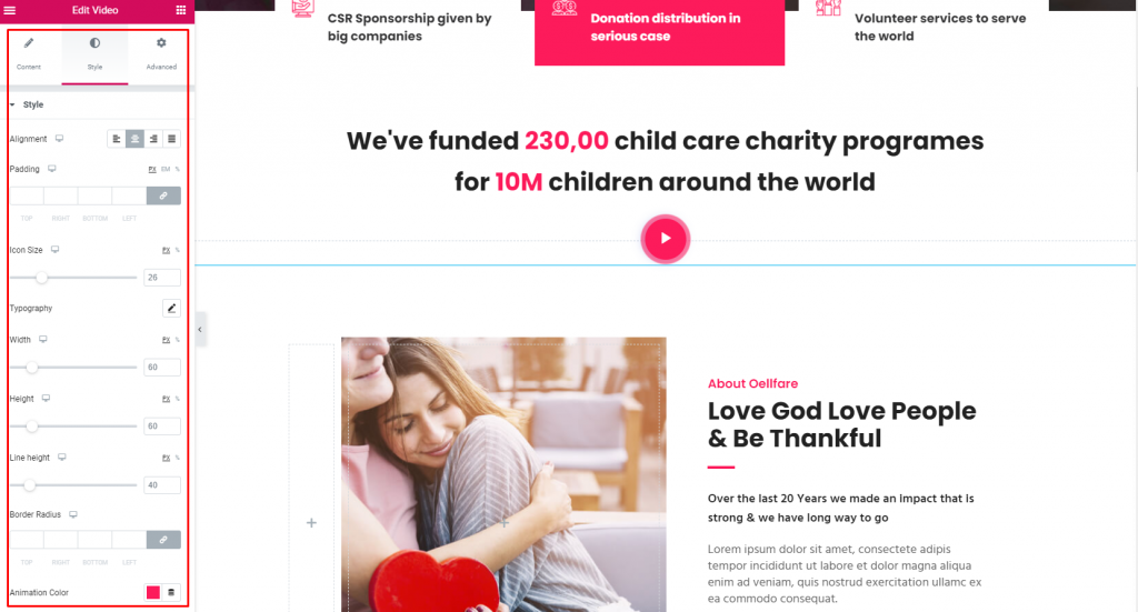
Play Button Color – Set a color for the play button.
Play Button Size – Set a size for the play button.
Call to Action
Call to Action element allow to display messages on your page.
Style – Choose a style you wish to use for the “Call to Action”
Content – Enter the text you would like
Button – Choose a Button and a size for displaying on the Call to Action. Input a text, set a link. a color for text and background, set a hover color and border color, margin, padding, font-size, font-wight, text-transform

Funfact

In Funfact shortcode settings has two fields. they are Image Position & Title Position. Image Position has four option, they are left, right, top & bottom.

Title Position has tow option, they are After number & Before number.

In Funfact shortcode content has four fields, they are Number, Use Suffix, Title and Description.

Set up image or icon in Funfact then use “Choose Image”

Image Box
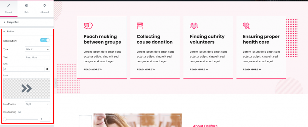
Image Box shortcode content has two options. They are Image Box and Button. Image Box has eight fields. They are Type, Alignment, Choose Image, Image Size, Choose Hover Image, Image Size, Title and Description
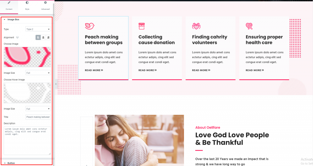
Button option has many field to decorate. You can also use icon, icon position, icon spacing, link, text and type.
