You will get pre defined widgets under Power Element section. Step by step we will describe what you will get or what will do with them. So let’s go
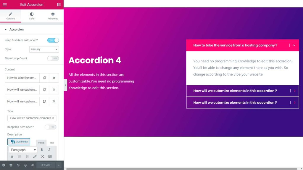
Accordion
Default Style
This section is for accordion option any one can add or delete different types of style.
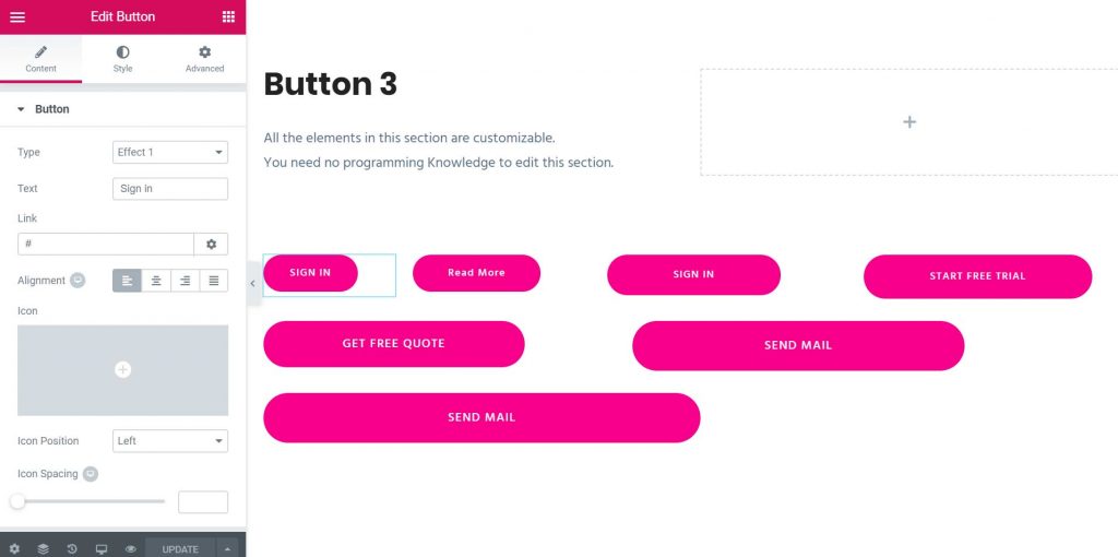
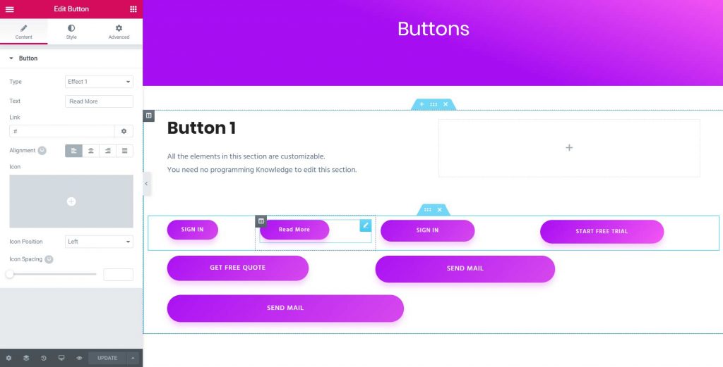
Button
Default Style
Linear Style
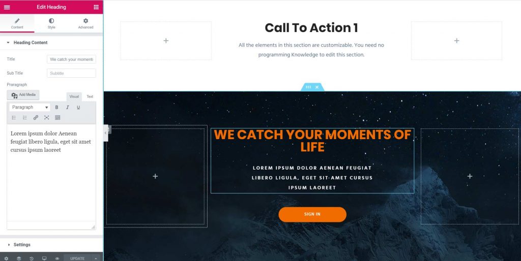
Call To Action
Simple Style
We can change different types of style of call to action
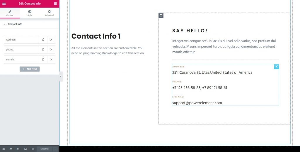
Contact Info
Simple Style
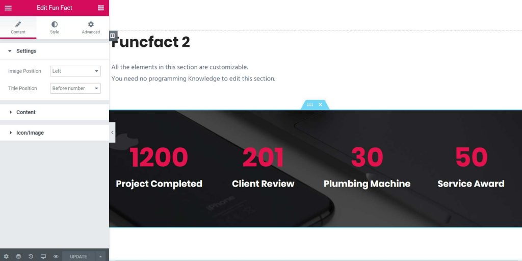
Funfact
Simple Style
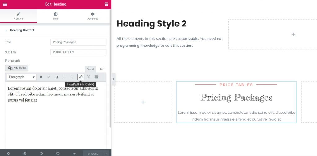
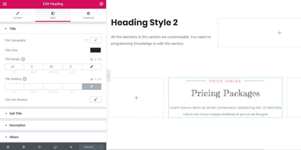
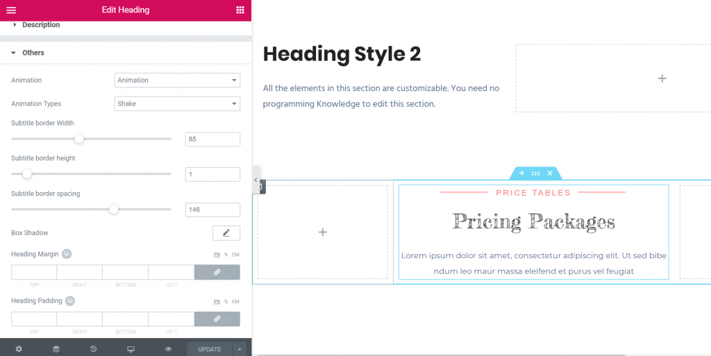
Heading
Simple Style
We’ve used title, sub title, description and subtitle border in heading content.
In a heading style has color, typography, padding, margin, text-shadow and many different options.
In others section has animation, subtitle border width, subtitle border height, subtitle border spacing, box-shadow, heading margin and heading padding
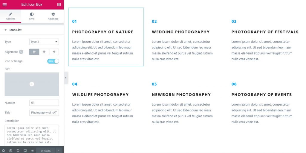
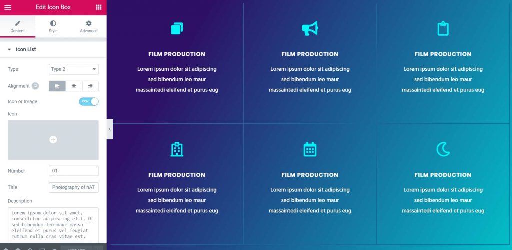
Icon Content
Number Style
Linear Background Icon Style
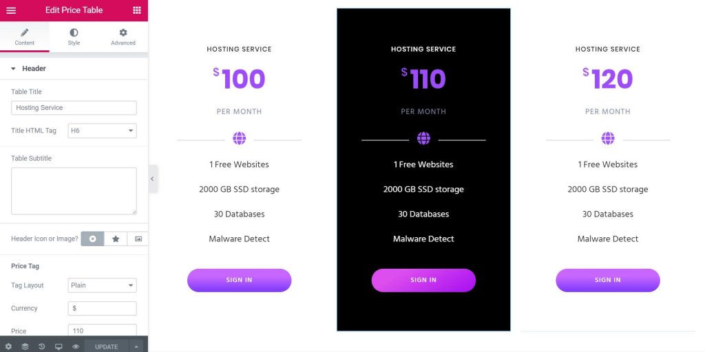
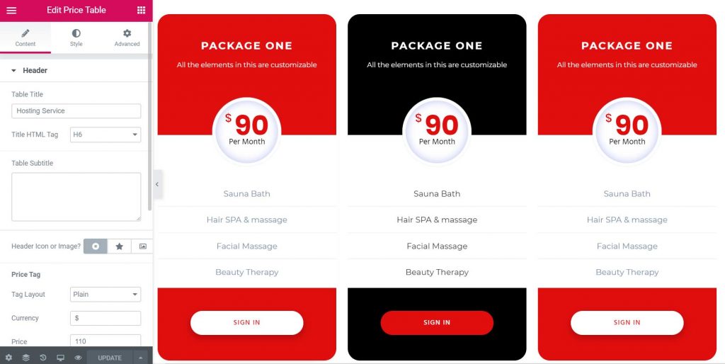
Price Table
Simple Style
Colorful Style
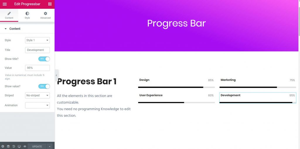
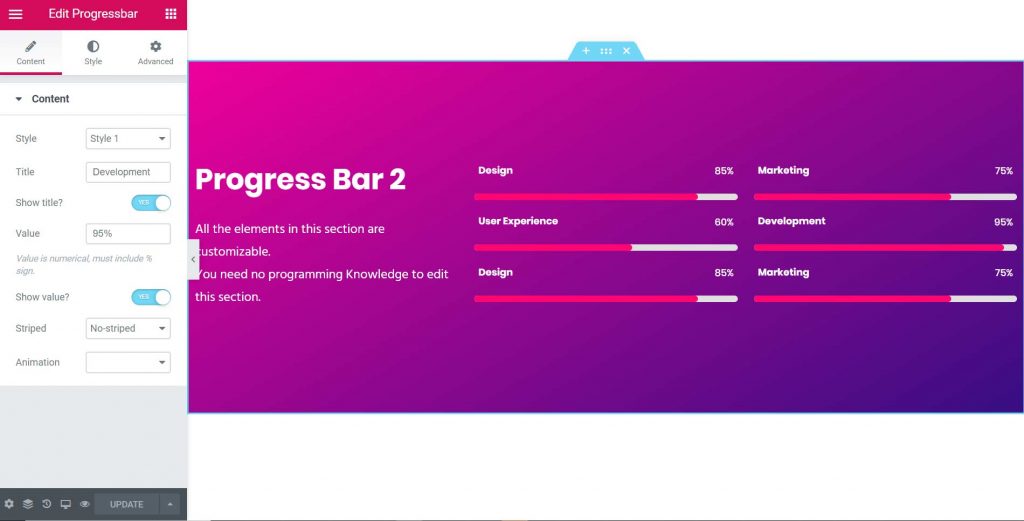
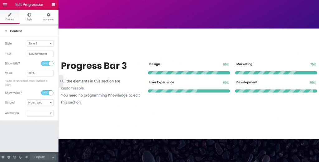
Progress Bar
Simple Style
Round Style
Stripped Style
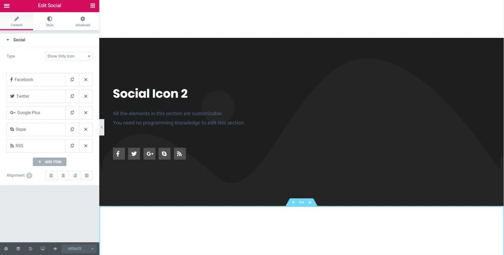
Social Icon