You will get pre-defined shotcode under Power Elements tab. Step by step we will describe what you will get or what will do with them. So let’s go
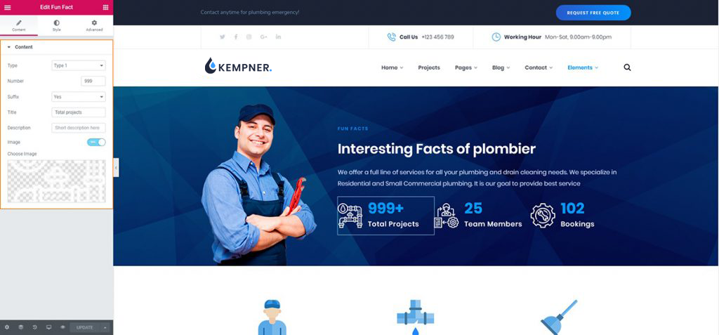
Fun Fact
In shotcode list you will find lots of shotcode that is our pre-designed shotcode. In fun fact you will get 3 different pre design funfact.
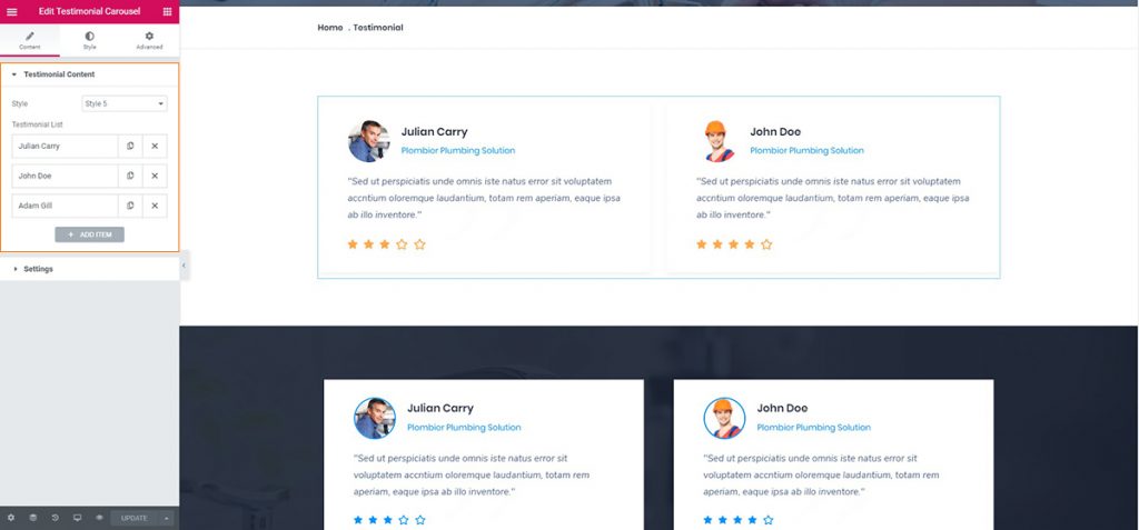
Testimonial
Here you can add testimonial with carousel. Also we add here another shotcode without carousel. You may choose your desire testimonial style.
Another testimonial has used in home 3, that is
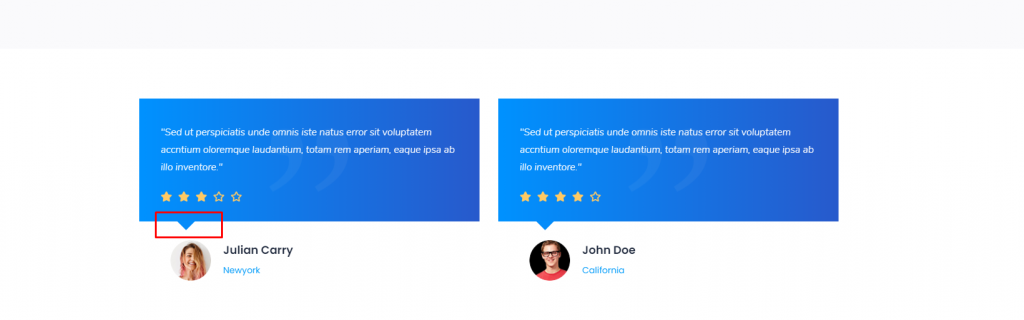
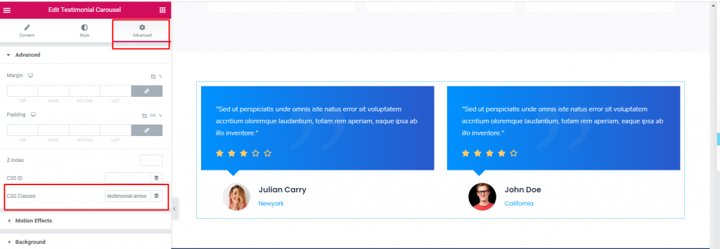
It is very easy to use in your theme. At first go to your theme and use Testimonial Carousel. In Testimonial Carousel you find Advanced option. After clicking Advanced you will find CSS Classes field. Then put testimonial-arrow class in blank field.
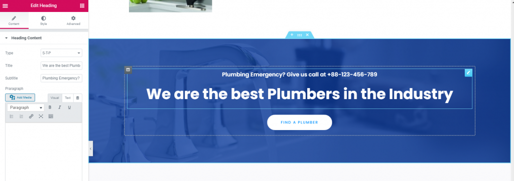
Heading
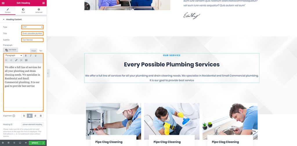
Here you can add here Title, Sub-Title, and Description also you may choose style here through using Type. Find it in orange marked box in below.
In home 3 you can find another Heading style.
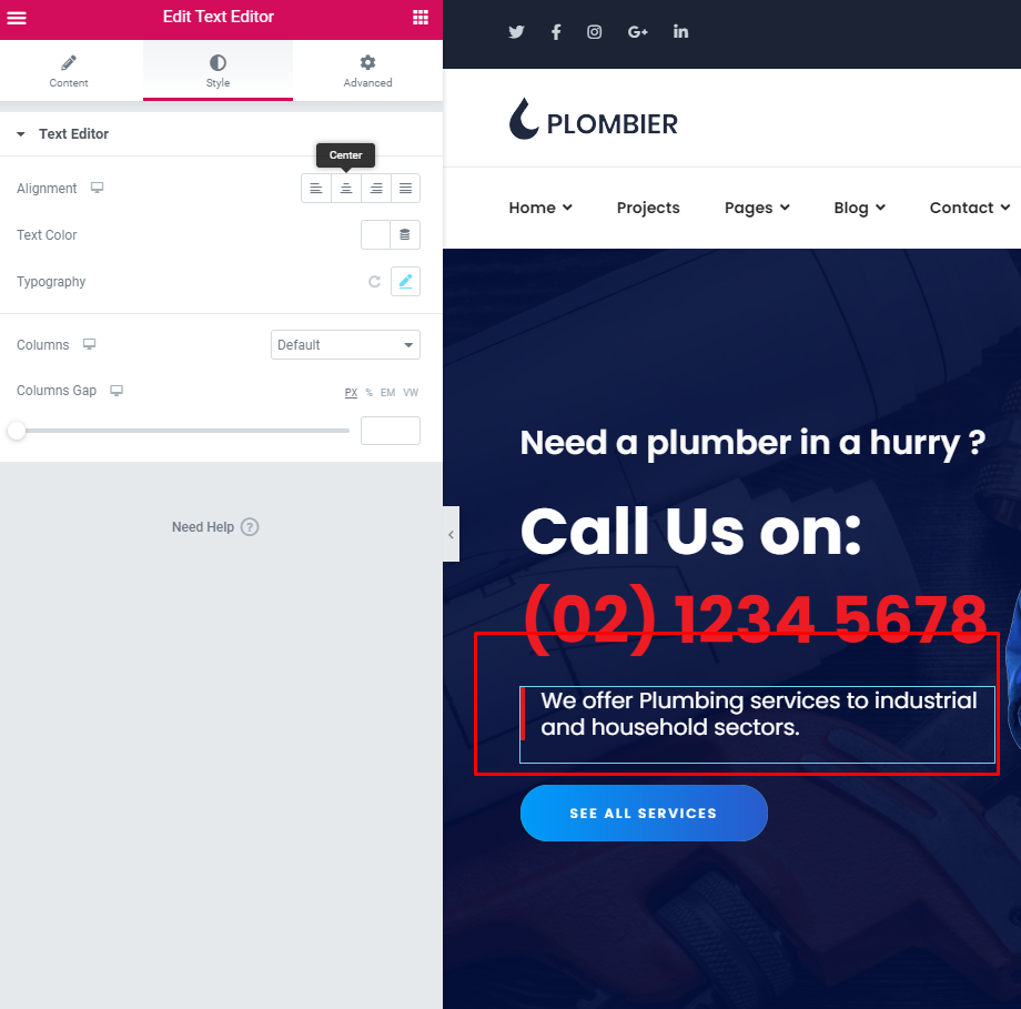
Text Editor in Advanced option you find border and used it in left border of paragraph.
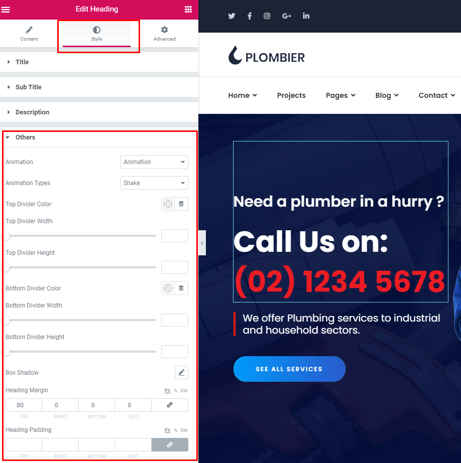
Text Editor in Style option has Others. In others there are many types of design as like Animation, Animation Types, Top Divider, Bottom Divider etc.
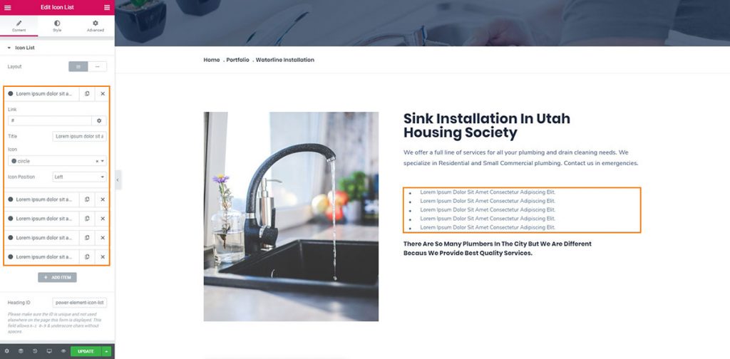
Icon List
Here you see the orange marked box. You can change icon with text through our icon shotcode.
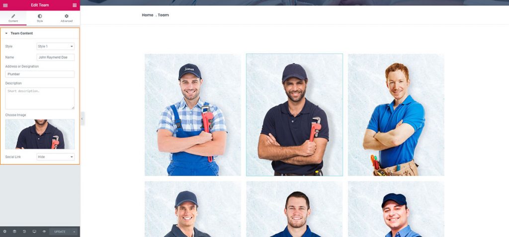
Team
Here we add three different style of team.
Clients List
You can use this shortcode to display your clients in a slider layout
In General section of Elementer builder you can find Image Carousel.
Number of Columns – Set the number of columns you wish to display.
Space Between Items – Set a predefined size for the space between items.
Columns Responsive – Choose between ‘predefined’ columns responsive settings, or set the column responsiveness manually for each responsive stage.
Enable Slider Loop – Set this option to “Yes” if you would like the carousell to loop back to the first slide after it shows the last slide.
Enable Slider Autoplay – Set this option to “Yes” if you would like the carousel to automatically change slides.
Slide Duration – Set how long (in milliseconds) a slide will stay on screen before switching to the next slide.
Slide Animation Duration – Set a duration (in milliseconds) for the slide transition animation to last.
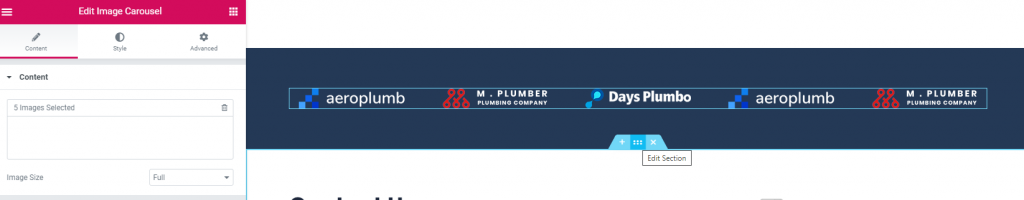
Image Box
In Power Element plugin has Image Box to create a box with image, heading and paragraph.

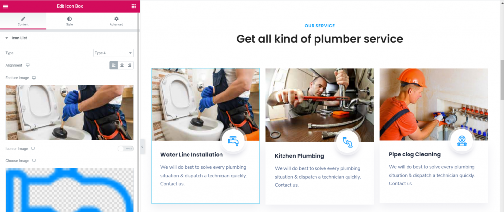
Icon Box
Icon Box is a powerful shorcode in Power Element plugin. Icon Box Content has different type, Alignment, Featured Image, Icon or Image, Title and Description.
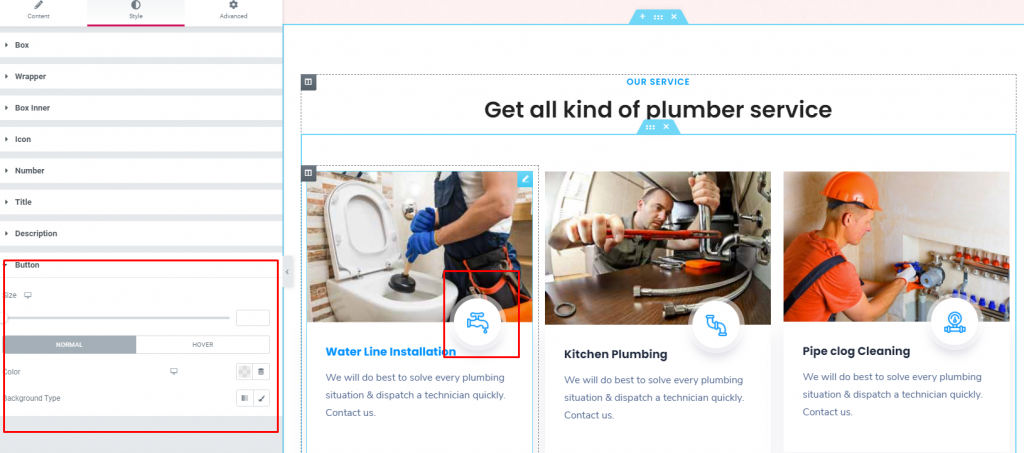
You can also change “Choose Image” using this button in Style
Portfolio Filter
In Power Element plugin list has important shorcode Portfolio Filter. It’s very simple and easy to use in your Kempner theme. Select Portfolio Filter from Power Element plugin list and create smooth gallery.Item Layout – Choose a style (layout and hover type) for the items in your portfolio list.
Title Tag – Choose a heading tag for the titles in your portfolio list.
Layout – has width, height, taxonomy, filter, gutter, grid, popup and crop image
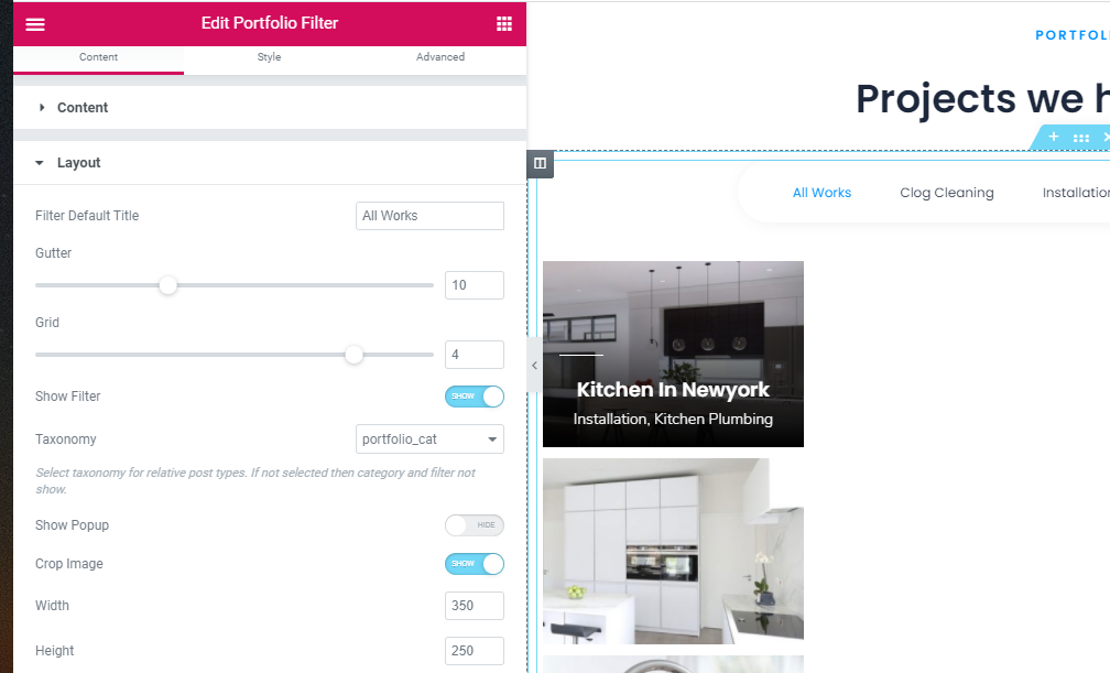
Content – has Author, Portfolio Categories, Posts Per Page, Portfolio Categories
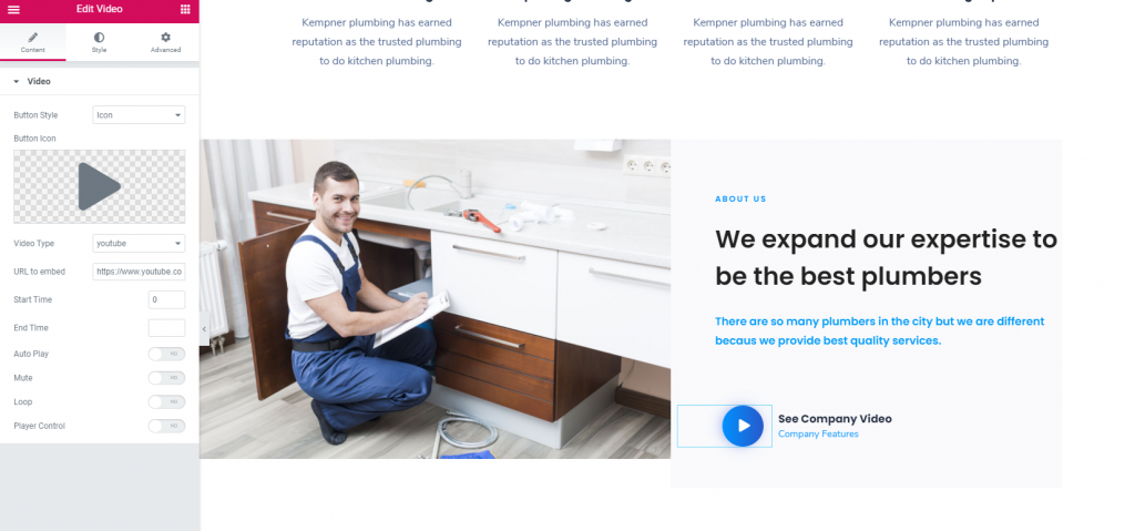
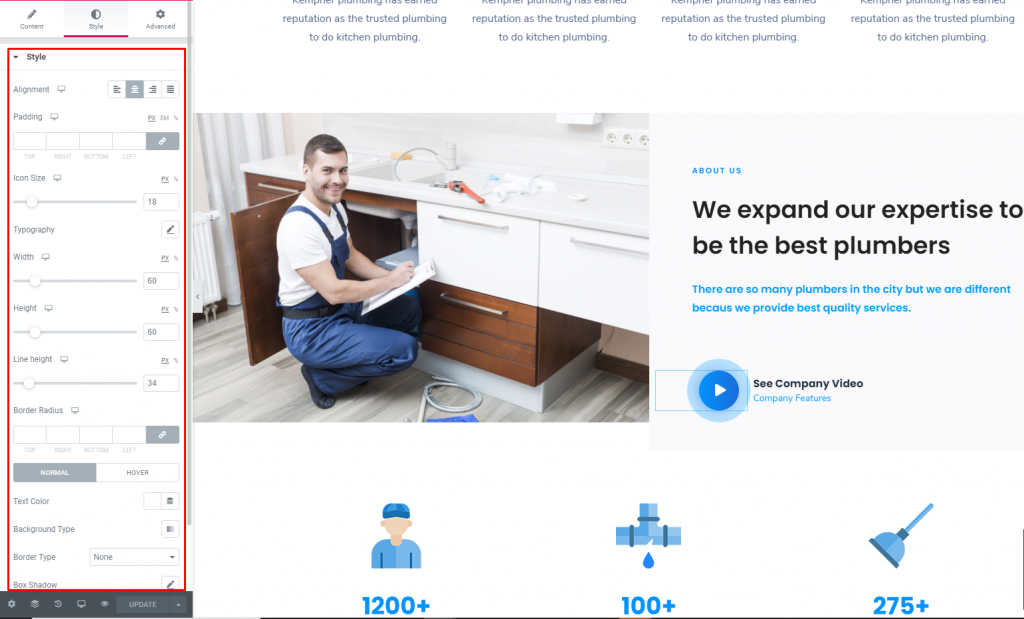
Video

You can use this shortcode to add a video thumbnail image of your choosing alongside a button which you can link to a video. Video Link – Input a link for the video.
Image – Upload an image you’d like to display as the video thumbnail.
Play Button Color – Set a color for the play button.
Play Button Size – Set a size for the play button.
Call to Action
Call to Action element allow to display messages on your page.
Style – Choose a style you wish to use for the “Call to Action”
Content – Enter the text you would like
Button – Choose a Button and a size for displaying on the Call to Action. Input a text, set a link. a color for text and background, set a hover color and border color, margin, padding, font-size, font-wight, text-transform